
Better snacks. Bigger Impact.

Branding for a Snacks & Vending Startup
This project was a blast to work on, from concept brainstorming and competitor research to brand discovery. One of the most challenging (and fulfilling) parts was finding a visual language that reflected what makes Legacy unique: a commitment to integrity, transparency, and putting people before profit. The clients connected with one of my early concepts right away, which made the process feel especially collaborative and rewarding. I developed a bold, playful visual identity that captures both the energy of the brand and its mission to offer healthier options with a personal touch.


Concept 1
This concept features a partially opened snack bag, symbolizing the brand’s focus on accessible, fresh, and convenient snacks. The folded corner reveals a hidden “L” shape, reinforcing the name while subtly nodding to the idea of unwrapping something meaningful, whether it’s a snack or a lasting legacy.

Concept 2
This concept captures the brand’s commitment to healthy, accessible, and exciting snacks through a playful icon made of cheese puffs, almonds, popcorn, an apple, a granola bar, and a chip. The granola bar and chip form an “L,” subtly reinforcing the brand name and the idea that small, mindful choices can leave a lasting impact.
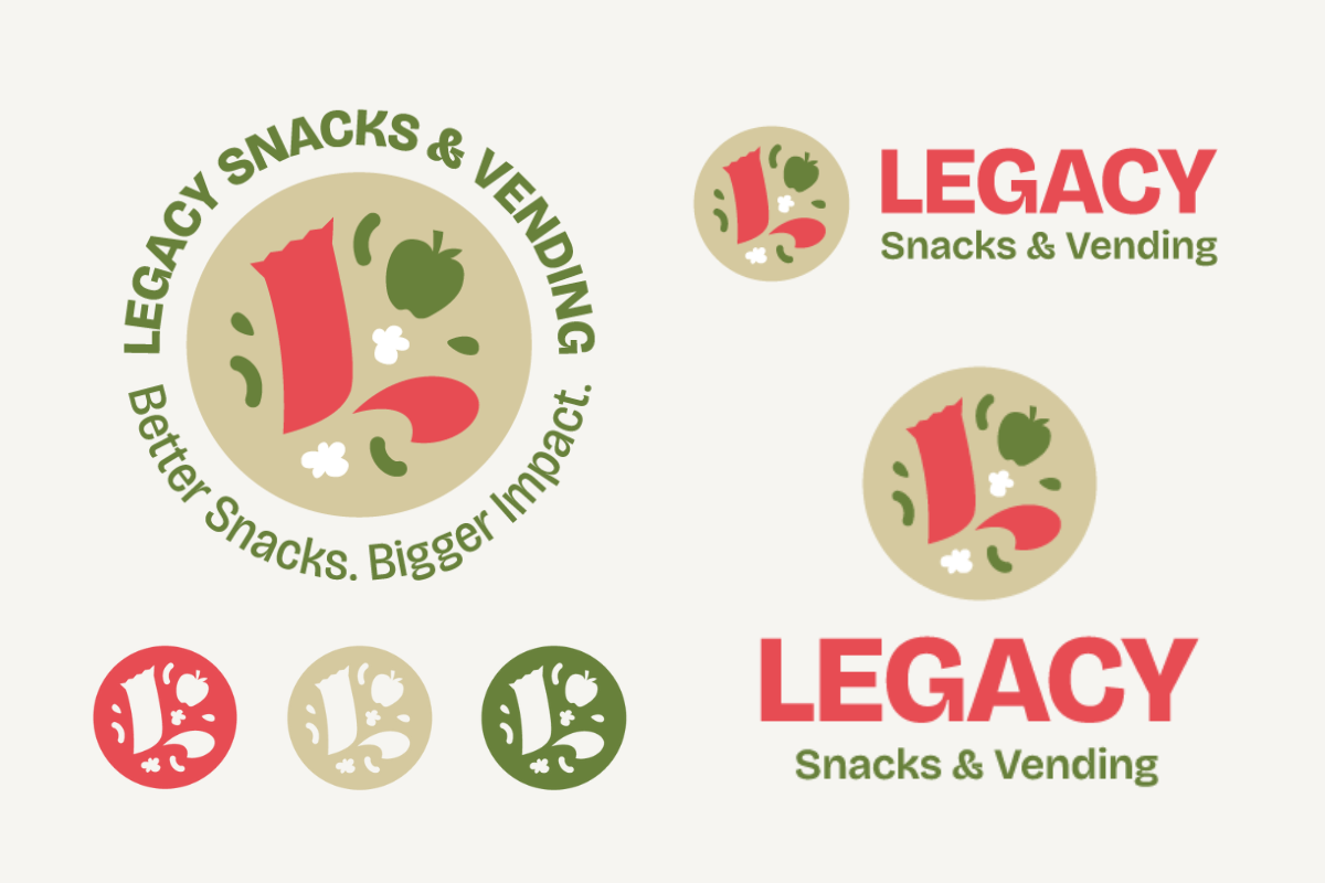
The Final Look
The visual identity came together through a blend of bold colors, playful iconography, and thoughtful symbolism that reflect Legacy’s values and personality. We delivered a comprehensive set of brand guidelines, additional corporate branding, and custom vending machine skin designs—ensuring consistency and impact across every touchpoint as the brand continues to grow.
